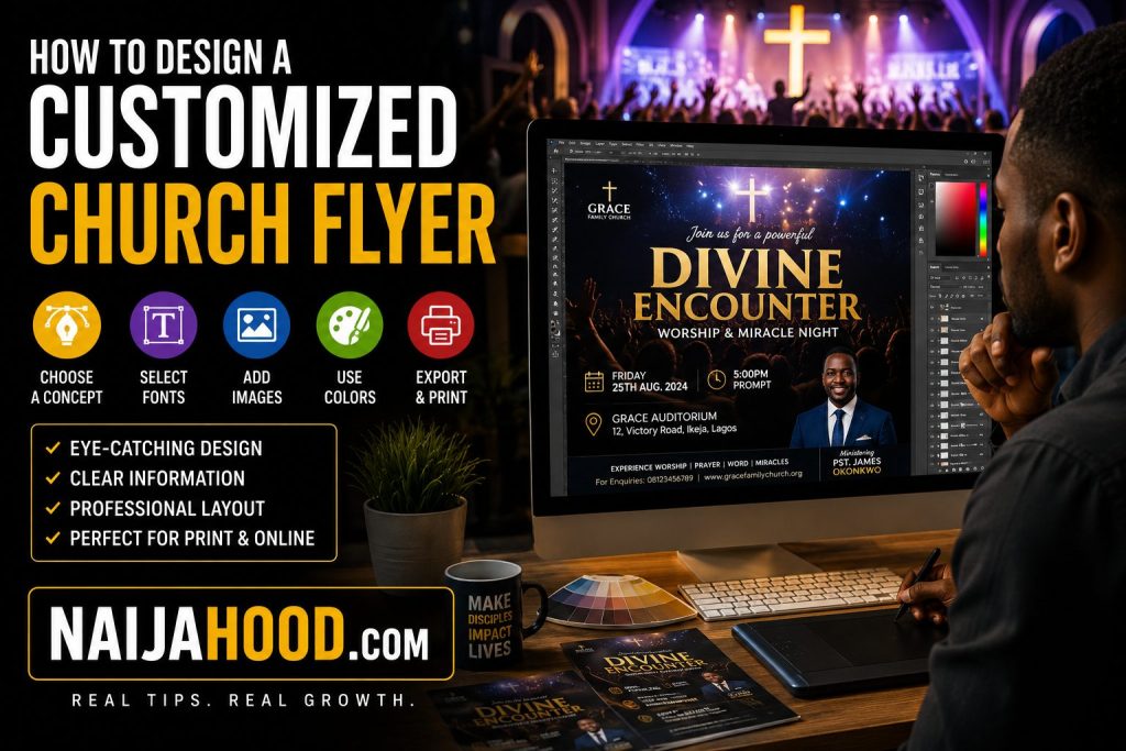
How To Design A Customized Church Flyer
Church flyers remain one of the most effective ways to promote church programs conferences crusades revival meetings and special services. Even in a world dominated by social media a well designed flyer still captures attention and encourages people to learn more about an upcoming event.
If you have ever attended a church program in Nigeria there is a good chance you first heard about it through a flyer shared on WhatsApp Facebook Instagram or printed and distributed within the community. The reality is that people often decide within a few seconds whether they want to continue reading a flyer which is why design plays an important role.
The good news is that you do not need to be a professional graphic designer before creating an attractive church flyer. With the right approach and a little creativity you can design something that looks professional and communicates the message clearly.
Let us look at the important steps involved in creating a customized church flyer that stands out.
Start With A Clear Purpose
Before opening any design software it is important to understand the purpose of the flyer.
Ask yourself a few simple questions:
- What event am I promoting
- Who is the target audience
- What action do I want people to take
A flyer designed for a youth conference may look different from one designed for a prayer retreat or Sunday thanksgiving service.
Having clarity from the beginning makes every other design decision easier.
Choose High Quality Images
One thing many people notice first on a flyer is the image.
Poor quality images can make even a good design look unprofessional.
When selecting images try to use:
- High resolution photos
- Clear portraits of guest speakers
- Worship scenes
- Church congregation images
- Relevant event visuals
A good image immediately creates interest and helps communicate the mood of the event.
Use Readable Fonts
One mistake many beginners make is using too many fancy fonts.
While decorative fonts may look attractive they can sometimes make information difficult to read.
Instead focus on clean and professional typography.
Your event title should be large and easy to see.
Important details such as date venue and time should also remain clearly visible.
Remember that many people will view the flyer on their smartphones.
If the text is difficult to read they may scroll past without paying attention.
Create A Strong Headline
The headline is usually the first thing people read.
For example:
- Night Of Worship
- Divine Encounter
- Breakthrough Conference
- Power For Exploits
A strong headline immediately tells people what the event is about.
At the same time avoid overcrowding the flyer with unnecessary words.
Sometimes simplicity creates a stronger impact.
Maintain Good Color Balance
Colors influence how people feel about a design.
Many churches prefer colors that align with their branding but that does not mean every color should appear on the same flyer.
Choose two or three main colors and use them consistently throughout the design.
Too many colors can make a flyer look confusing.
A balanced design usually appears more professional and easier to understand.
Include Essential Event Information
No matter how beautiful a flyer looks people still need the important details.
Make sure the flyer clearly includes:
- Event name
- Date
- Time
- Venue
- Guest speakers
- Contact information
One common mistake is creating a visually attractive flyer that leaves people confused about where or when the event will take place.
Always prioritize clarity.
Use Proper Layout And Spacing
A crowded flyer can be difficult to read.
Giving elements enough space allows important information to stand out.
Professional designers understand that empty space is not wasted space.
In fact proper spacing often improves the overall appearance of a design.
When arranging your flyer think about balance and organization rather than filling every corner with text.
Design For Both Print And Social Media
These days many church flyers are shared online before they are ever printed.
Because of this it is wise to design with both formats in mind.
A flyer should look good:
- On WhatsApp
- On Facebook
- On Instagram
- On church websites
- In printed form
This approach helps maximize visibility and reach more people.
Review Everything Before Publishing
Many flyer mistakes happen because people rush to publish.
Before sharing the design take a few minutes to check:
- Spelling
- Dates
- Contact numbers
- Speaker names
- Venue information
A small mistake can create unnecessary confusion and reduce credibility.
Interestingly some of the most expensive design errors are not caused by poor graphics but by incorrect information.
Use Design Tools That Make The Process Easier
You do not need expensive software to create a church flyer.
Many designers use tools such as:
- Canva
- Photoshop
- Adobe Express
- CorelDRAW
Beginners often find Canva especially useful because it provides templates that can be customized quickly.
The important thing is understanding design principles rather than relying solely on software.
A Simple Observation
If you compare church flyers from a few years ago with modern designs you will notice something interesting.
The best flyers today are usually simpler.
They use fewer elements
Cleaner layouts
Better images
And stronger focus on the message
Sometimes removing unnecessary design elements improves a flyer more than adding new ones.
Final Thoughts
Designing a customized church flyer is not just about making something attractive. It is about communicating a message clearly while encouraging people to take action.
When you combine quality images readable fonts good color choices and clear information your flyer becomes much more effective.
Whether you are promoting a conference revival service worship program or community outreach event these principles can help you create designs that look professional and leave a positive impression.